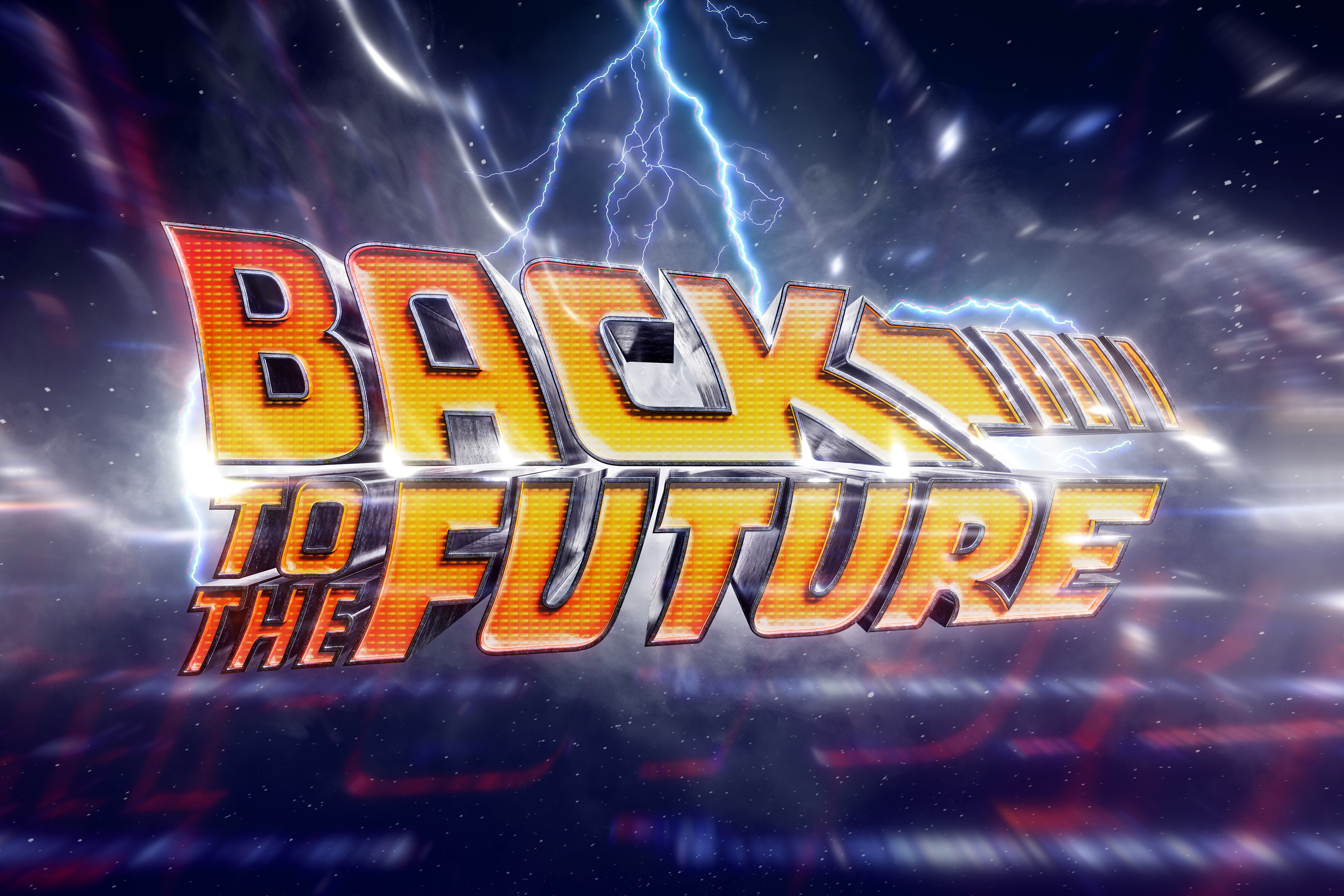
back to the future:
Personal Project | POSTER DESIGN & COMPOSITE SERIES
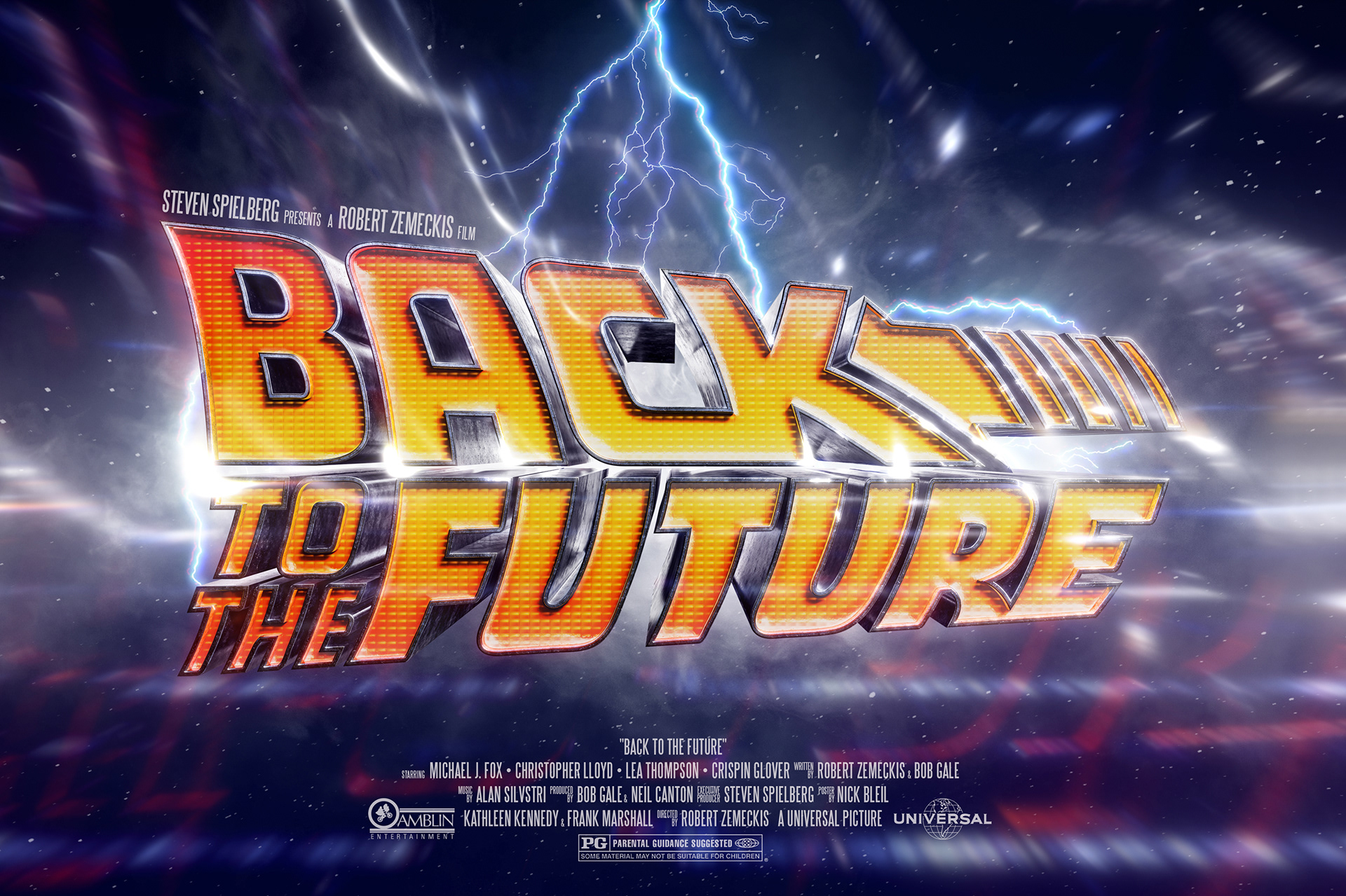
I decided to do a type/title series on a few of my favorite film classics. The goal was to create something special based solely around the title and or logo, but adding visual elements of interest with a more modern flair. The other challenge in doing this was the existing amount of alternative movie posters that already existed for these films. How do you compete with all that's out there?
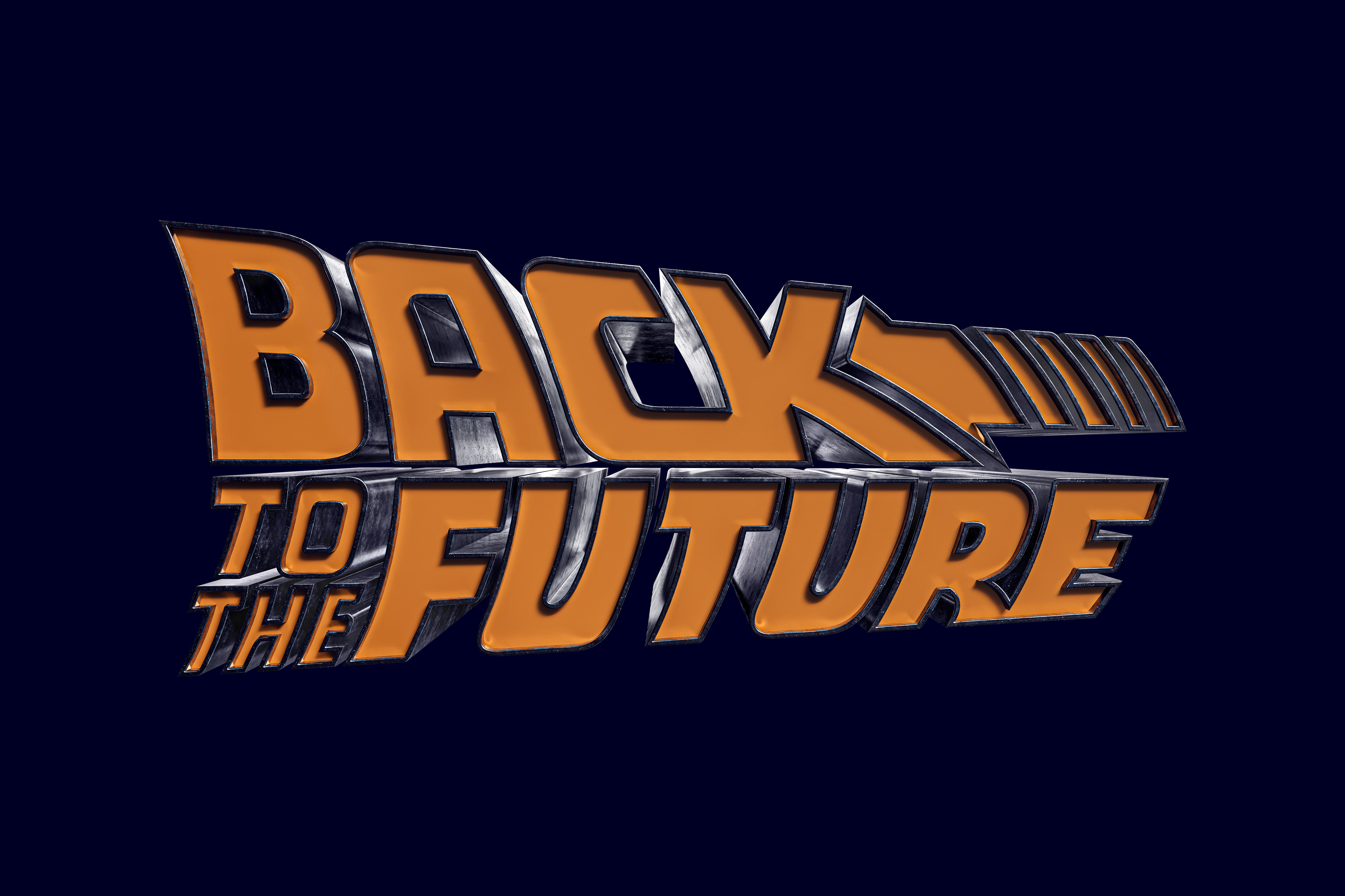
This was the poster that kicked off the entire series. My original intent was to do them all like this, with an emphasis on the typography, but I decided to pivot thereafter. I wanted to pay homage to the original BTTF film poster, but bring the typography to life in a way that we see in a lot of today's films. The idea here was to mimic the likes of the DeLorean in the type build. Also, in maintaining the original logo's color scheme, the tail light texture worked out perfectly.
Rendered in Adobe Dimension. 3D elements built in illustrator. Retouching and compositing in Photoshop.
PROCESS FRAMES:
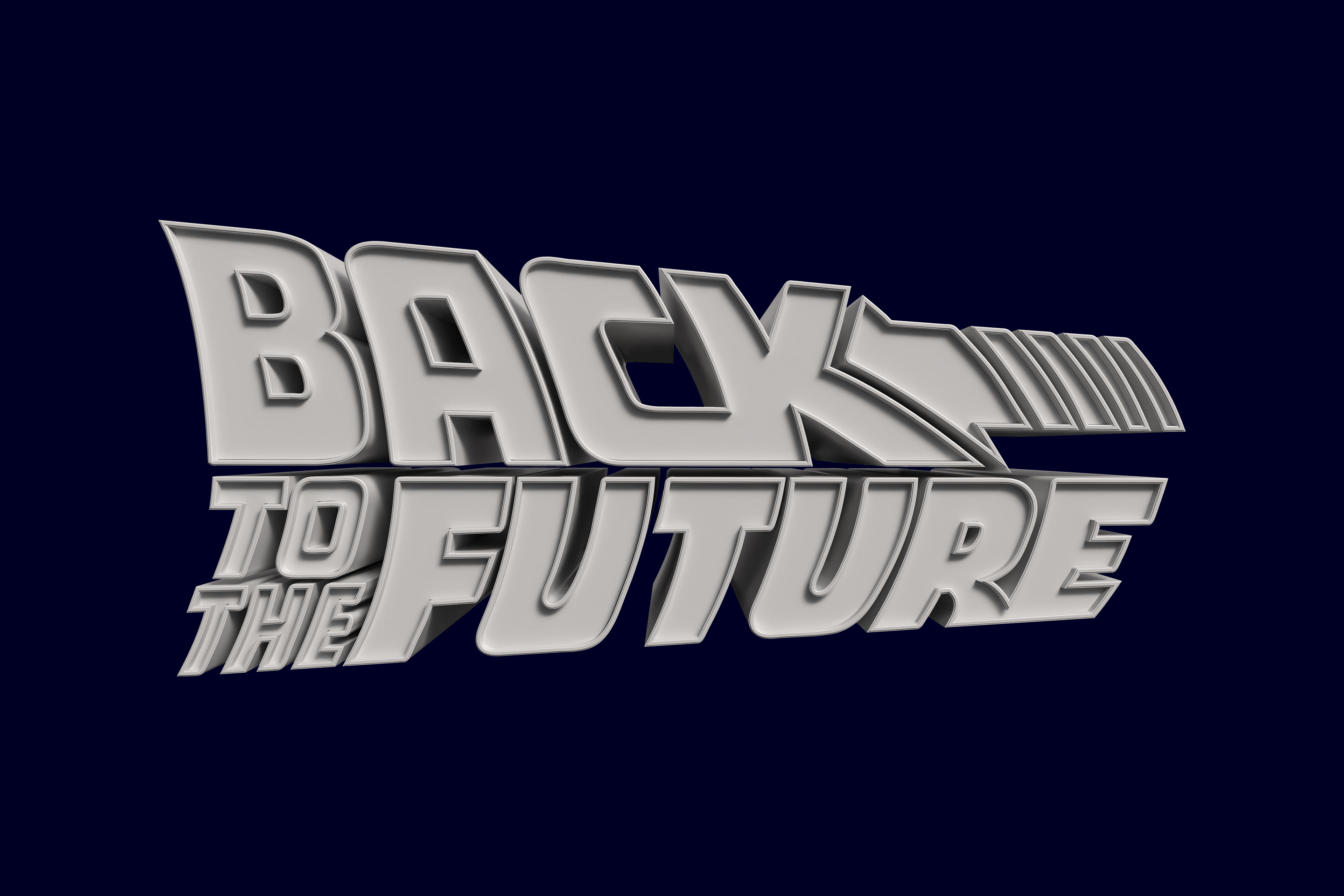
BASE RENDER
BEVEL MATERIALS
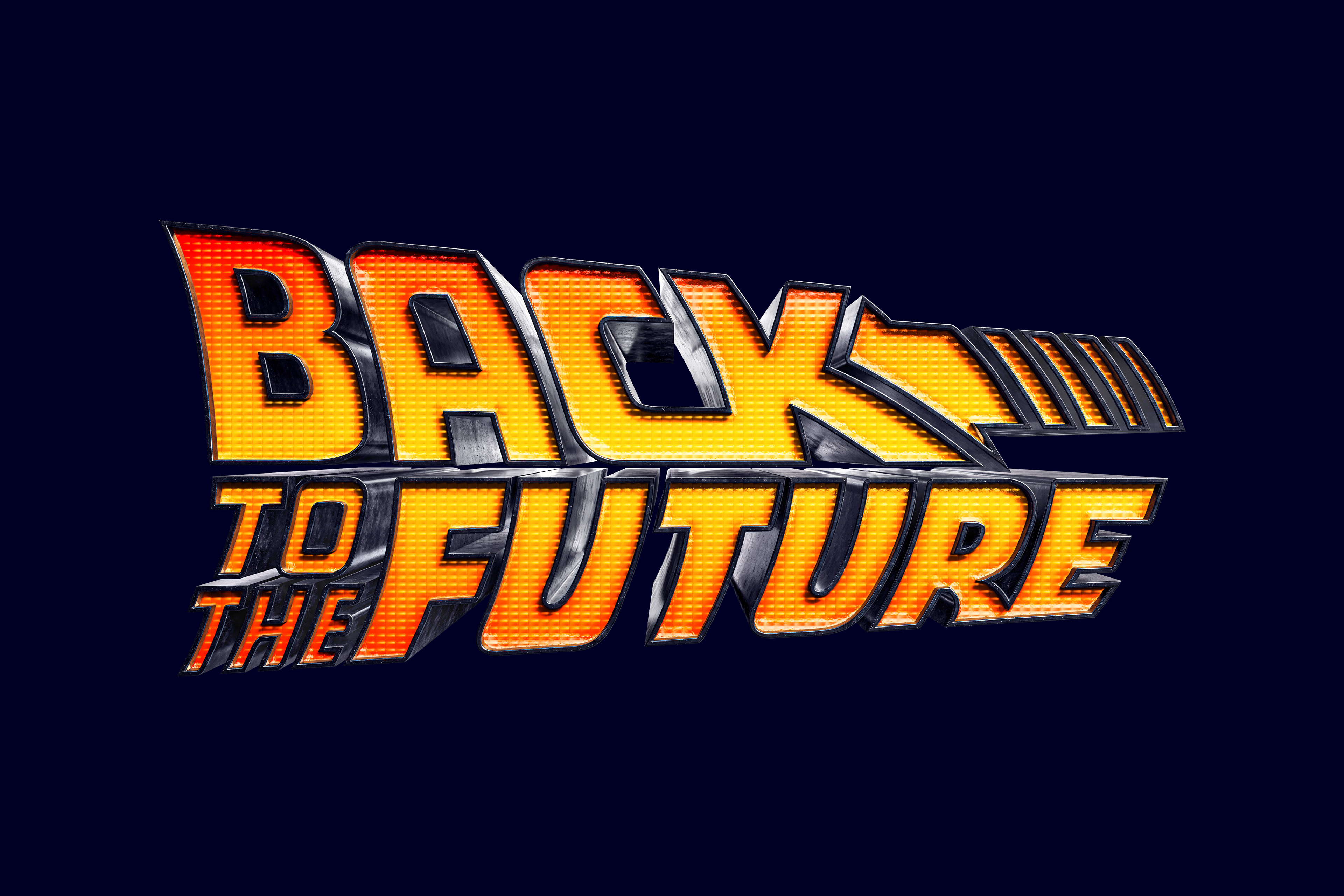
LIGHT TEXTURE
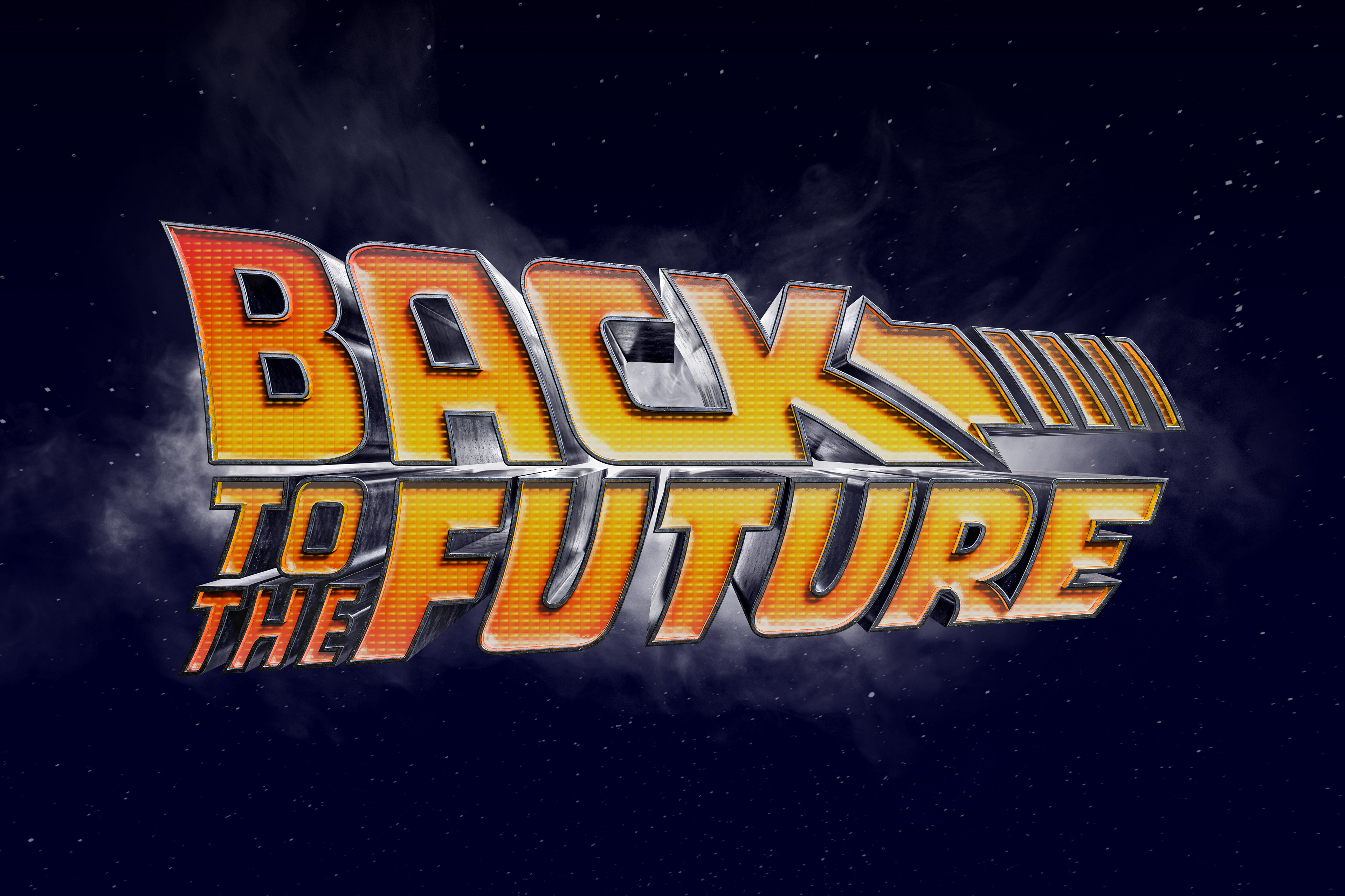
BACKGROUND BUILD-UP